More face-time with readers, the secret to Adverpost success
by henrycopelandTuesday, October 12th, 2010
We’re continuing to tweak the Adverposts and are very excited by early advertiser feedback.
(Want more info on Adverposts? See this post.)
Recently Little Partners used our new Adverpost unit on parenting blogs like Modern Home Modern Baby, The New Homemaker, Smart Mom Picks, and Smart Mom Deals.
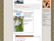
Their product, The Learning Tower, is an adjustable height platform, kind of an upscale toddler step stool with learning built in. Too nuanced and new to summarize in a single image, The Learning Tower seemed perfect for Adverpost.
Last week, I checked in with Damien Lamanna, Digital Media Director at Morgan + Company, who instigated the buy.
Lamanna said the client got a 2.85-fold return on the ad buy, and that’s “without counting any of the long term brand-building.”
Though the Adverpost’s cost-per-click was higher than on other ad units the client tested, visitors referred by the Adverposts spent SEVEN times more time on the advertiser’s site than those referred by other units. Here’s a thumbnail of the ad:

Lamanna thinks this higher time-on-site was because Adverpost clickers were already acquainted with the product from reading the ad. Having seen the ad over several days, they were familiar with the product even before clicking. When they clicked, they were primed to engage.
The visual for The Learning Tower’s ad was a rotating flash unit. When they next advertise, we’ll suggest using a static image without any text and adding more links to the ad text.
Update: Adverposts can now include video!
